This is the perfect video for Memorial Day weekend when so many people in the U.S.A. take a road trip.
Impress your family and friends after watching. Geek-out on FONTS! Aren’t they cool?
Enjoy your weekend as you obsessively look at road signs in a new way.
(If you cannot see the embedded video in your newsletter email, please click the headline and go directly to our site to view it.)
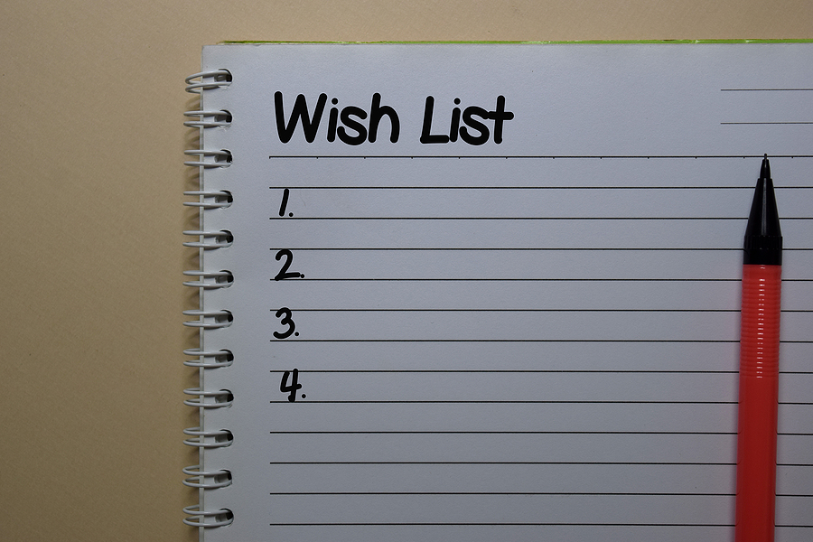 A Literary Agent’s Wish List

Bethlehem is my hometown! Fortunately, they didn’t choose some of Pa’s more saucy town names as examples:)
Robin, I found it interesting that some of those “saucy names” are in areas with religiously conservative folks. Not judging here, just sayin’…..
Oh, yesssss! We think the same thing when we’re driving through…
How interesting! I will take a further look the next time I drive somewhere on a highway!
Yay, fonts!
I have to say, as someone for whom fonts are a second love, they’re something that you can’t un-see once you start noticing them. For example, I can now spot Minion Pro whenever it’s used in a book I pick up. Or even in this page, I noticed the use of Playfair Display in the header font. (Nice choice, by the way.)
The web is particularly nice for this because you can right click on some text and choose “Inspect Element” (“Inspect” if you’re in Chrome) to see the font it uses. I’ve learned about a lot of nice fonts this way.
That’s fascinating! I’m all for being able to see better at fast speeds, but didn’t know the science behind it.
This was so interesting. I never paid attention to the font on road signs. Next time I will.