We’ve heard the cliche “Don’t judge a book by its cover.” True. But you do “buy a book by its cover.” We all do. That colorful billboard attracts the eye, disseminates information, and sells the content. Even when the billboard is the size of a postage stamp on Amazon.com, BN.com, or iTunes, you make a judgment on the quality of the book based on its cover.
It is hard to find just the right image, texture, font, and copy to make a book cover work. Mix in the fact that everyone has different tastes, and you have a recipe for controversy. Back in my days at Bethany House, one person on the cover-design committee didn’t like the color orange; so the head designer tried to work around that to avoid getting work voted down in those meetings!
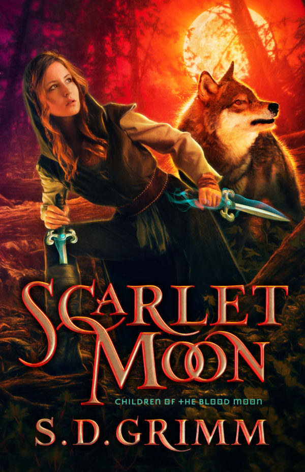
Today I’d like you to take a quiz on the following books and vote A, B, or C as to which cover design you like best. Try not to peek at the one in print before you vote. Think like a marketer and not only your personal taste. Think about the book itself and which image reflects the content in a way that you might buy it. These are actual cover designs I have seen for the same book in the past. I’m sorry, the thumbnails are small and cannot be clicked to enlarge. That is part of the point of this exercise; it teaches you to view a cover like one is viewed online. And when you finish voting, watch the embedded video below to see the extraordinary cover variations for a general-market novel published by Penguin Random House. (FYI, a couple of the images are a little more racy than I would like.) I cannot imagine the time and cost it took to create the final design.
I posted this quiz ten years ago on this blog, and over 50 readers voted. None got them all correct! Can you do better without looking them up? I will post the “correct” answers later in the day.
|
A |
B |
C |
 |
 |
 |
 |
 |
 |
 |
 |
 |
 |
 |
 |
 |
 |
 |
 |
 |
 |
 |
 |
 |
Place your vote below!


